Japanese Poster Design
From the hands of Edo period artisans carving scenes into woodblocks to the high-speed digital printers of today, the history of posters in Japan is quite a fascinating narrative of cultural evolution. It's a visual story that began with the ‘ukiyo-e’, picturesque prints that were mainly being used to convey news, advertise products, theaters, and -cough- brothels. Fast forward to today’s kaleidoscopic spectacle of modern-day visuals that continue to charm and inform commuters and city dwellers.
When you juxtapose Japan’s poster scene with the global stage, distinct cultural flavours start to emerge pretty quickly. In the states, for example, public posters typically tend to grab attention with bold text and straightforward messages that match the American communication style—get straight to the damn point already. European posters, particularly in France, are more poetic, elusive and tend to dance with a different rhythm, flaunting artistic vibes reflective of their romantic history, they are often detailed and ornate.
Japanese posters on the other hand, mostly tend to thrive on subtlety and a high-context visual scheme that communicates more with less, very much in line with the Japanese aesthetic of Ma (negative space). This not only reflects the Japanese cultural inclination towards understatement but also aligns with a modern emphasis on sustainability and ecological consciousness.
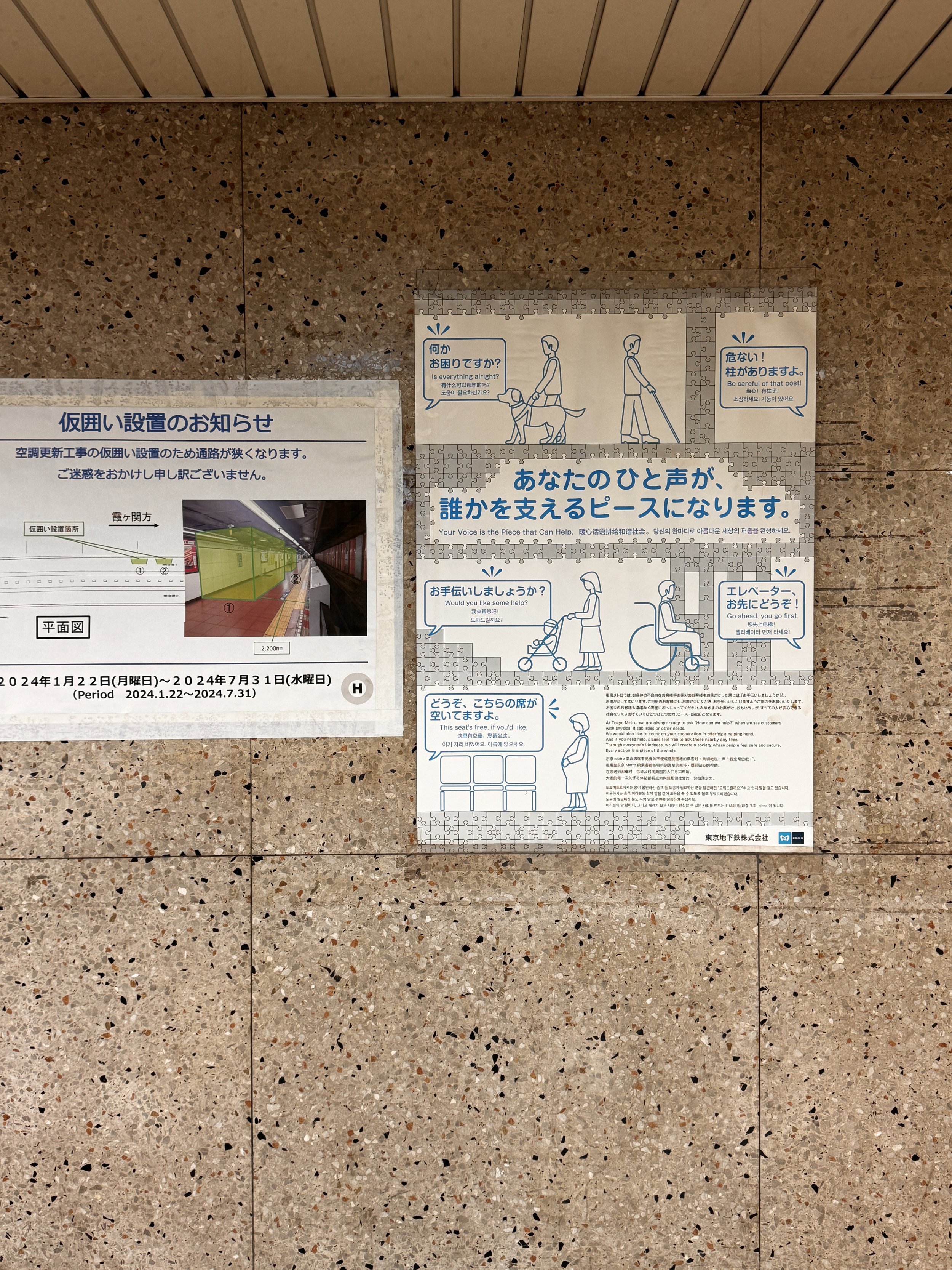
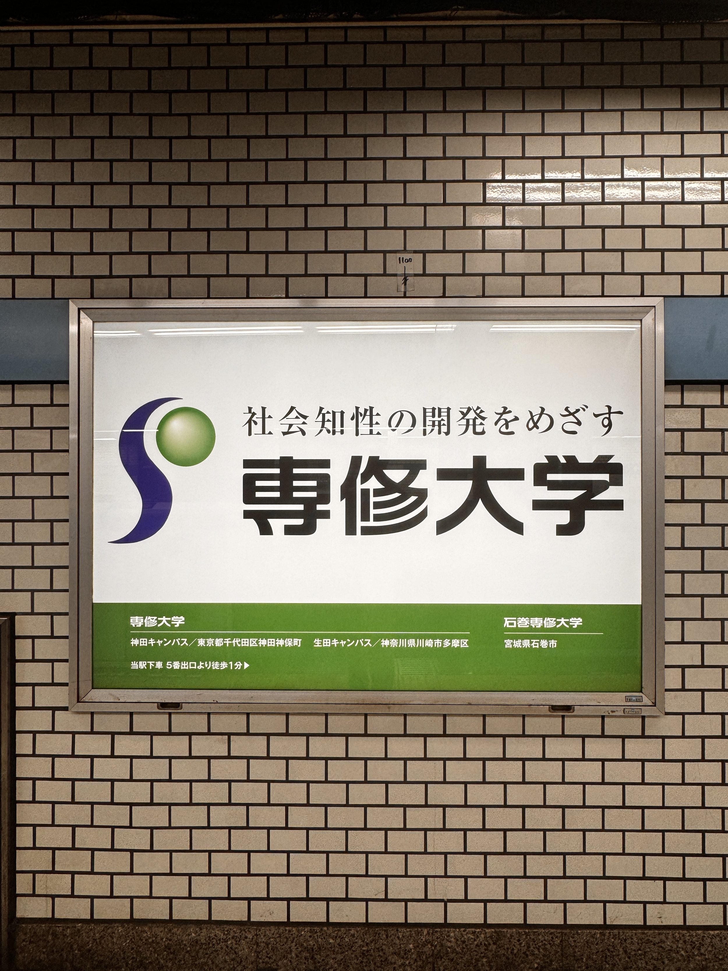
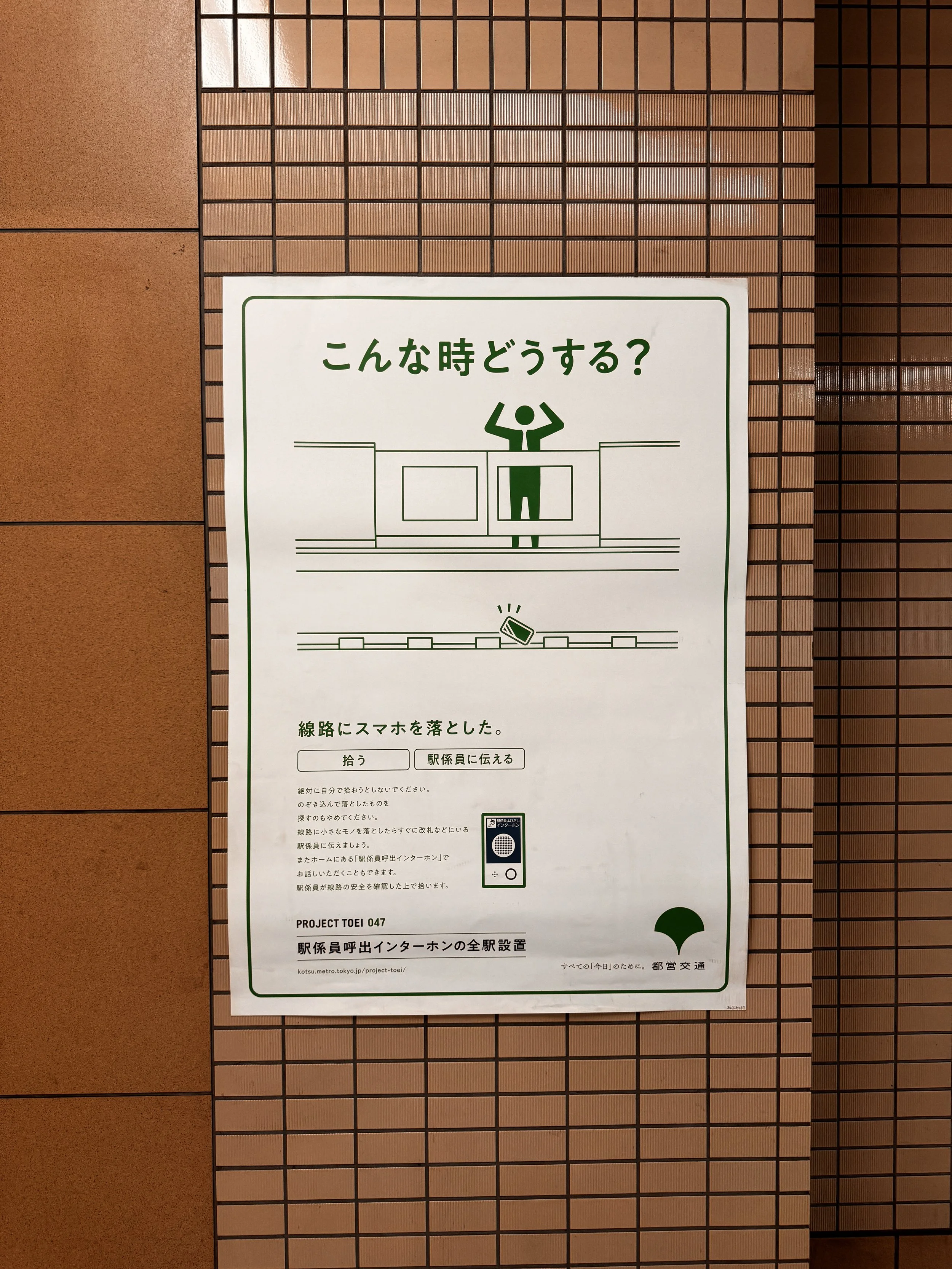
From the posters promoting the tranquil beauty of the various regions of Japan encouraging local tourism, to the quirky and playful safety announcements, each piece is a masterclass in visual communication. One thing is for sure however, the Japanese are never shy to experiment with a myriad of styles -from photography to illustration- to get the message across in the most suitable manner possible.
Starting with the poster announcing the opening of a new food court at the LUMINE Mall in Shinjuku. A delightful tableau that celebrates and draws viewers into a world where oversized food items and fashion-forward characters coexist. It's a world that's larger than life, inviting a sense of curiosity and delight, echoing the exuberance of Japan’s shopping and dining culture.
The typography which announces a grand opening makes use of both Japanese and English text to cater to a broad audience, exemplifying Japan’s role as a global hub that still maintains its unique identity. Photography, 3D rendering, Experimental Typography, simply awesome.
Then we have the ‘Tohoku’ posters which employ a serene palette, beckoning viewers to explore the relaxation and beauty of the northern Japanese region. The juxtaposition of seasonal landscapes with the minimalist design invites introspection and calm, which is characteristic of the Japanese approach to celebrating nature. From the use of soft gradients in the background to the elegant, spare use of text, these poster series encapsulate Japan's meticulous attention to detail and reverence for nature. Hold on, there’s more … In stark contrast, the public safety posters exude a different flavour of Japanese design: humour paired with vibrant, cartoon-like illustrations. Mascots are obviously quite common element in Japanese visual culture -duh!- , they help foster a sense of community and approachability around important messages. The bold, simple colours and characters draw our attention pretty damn effectively, ensuring the message is not only seen, but registered. It seems only Japanese design can get away with fusing functional and whimsy without anyone batting an eye!
Whether channeling minimalist elegance or chaotic splendor, these illustrated posters do more than merely advertise; they captivate the imagination, tell stories, and create iconic cultural symbols that resonate deeply. This blend of tradition and innovation, simplicity and complexity, makes the art of Japanese poster illustration a fascinating study in contrasts and a powerful form of communication that I believe the west can learn a thing or two from. Illustrators love me now, ha!
Now, on to train poster, which announces the debut of a new line (Not sure to where?), but uses a combination of traditional imagery and modern design ‘ala old meets new’ to convey celebrating progress, while acknowledging heritage. Flower petal bursts, vibrant colours and new beginnings, it’s pretty exciting! Now if only we could start getting some ‘Shinkansens’ up and running here in the west, sigh.
Now check these posters advertising television services and urban real estate that capture the contemporary urban lifestyle while remaining unmistakably Japanese in their clean lines and minimal layout, all the while still communicating modernity X tradition -which seems to be a common theme now that I think of it- using crisp clean design to get the message across.
I should also mention that in Japan, from what I’ve found out, the move towards sustainable design practices is more and more common in how public posters are produced. Using eco-friendly materials such as recycled paper and soy-based inks is pretty commonplace, underscoring a vital societal commitment to environmental stewardship, and it’s not just lip-service, they mean business, green business. This practice is a testament to Japan’s foresight in integrating sustainability with art and communication, setting a benchmark that is yet to see widespread adoption in many other countries where visual impact often precedes ecological considerations.
These Japanese posters reflect a visual language where every element, from colour choice to typography, is selected for harmony and subtlety and almost always leaves us with a poetic je ne sais quoi feeling. Japanese posters are high-context, engaging, and emotionally resonant. They maintain an enduring respect for aesthetic craftsmanship and a deep understanding of visual storytelling beyond graphical trends that seem to dominate public communication in western streets and posters. I could go on and on, but I’ll let the posters do the rest of the talking from here, enjoy!


